Blog
The Tree Swing Cartoon: What Your Customer Actually Wanted
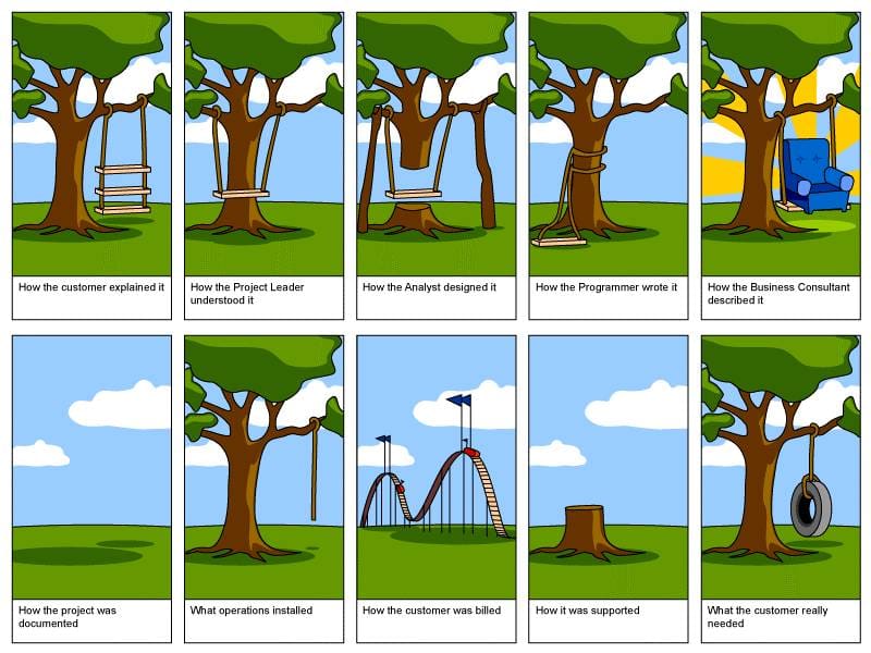
A founder paid $340,000 for a six-microservice platform around a three-step user journey. Every CTO has lived a panel of the tree swing cartoon. A walk through all four, with the audit I run before any code review.
A founder pulled me into a Loom last week and walked me through the platform her team had spent nine months building.
Six microservices. A bespoke event bus. An admin panel with twelve role types. A reporting layer that needed its own staging environment.
The customer journey she described at the end of the demo had three steps. Sign up, upload a file, get a number back.
She paid $340,000 for the platform around those three steps.
That is the tree swing cartoon. It has been the tree swing cartoon since the 1960s, and it will be the tree swing cartoon next year. The names of the technologies change. The shape of the failure does not.
Why this cartoon refuses to die
Every CTO I know has a copy of this somewhere. Pinned to a Slack channel. Saved in a "rant images" folder. Ready to drop in the next time a stakeholder asks why the project is late.
It survives because it is the most accurate picture anyone has ever drawn of how software actually gets built.
The customer asks for a swing. The story leaves their mouth, runs through ten layers of an organization, and arrives at the tree as a structure that solves problems nobody has.
The cartoon is funny because it is real. The cartoon is sad for the same reason.
I am going to walk through the panels above and tell you what each one looks like in a real engagement, because if you can spot the panel you are currently in, you can usually still get back to the swing.
How the customer explained it
Top-left panel. A swing with two seats stacked one above the other.
The customer drew a picture in their head of what they wanted, and the picture was already a little weird. It was already over-specified. They were already worried that the simple version they really wanted might not be impressive enough to ask for.
So they asked for the version with two seats. Just in case.
This is where almost every project starts. The customer's first ask is almost never their actual need. It is the most defensible version of their need, dressed up so the meeting feels worth having.
Real-world tells:
- The first kickoff document has 14 use cases. The actual product covers 2.
- The customer keeps adding "and also it should be able to" before anyone has built anything.
- The CEO described the product to the board last quarter. The team has been chasing that description ever since.
If you skip step one of the audit further down, this is the panel you are stuck in forever.
How the project leader and analyst translated it
Panels two and three. The project leader sees a basic plank on two ropes. The analyst designs a swing where the seat is a tree stump.
This is what happens when the customer's already-weird ask gets translated by people who have never met a customer.
The project leader simplifies. The analyst over-engineers. Both are doing their job. Neither has any way to test their interpretation against the original need, because the original need has already been compressed into a Jira ticket titled "swing v1."
Real-world tells:
- The architecture diagram has more boxes than the product has features.
- The team is proud of the abstractions and unsure about the user.
- Half the design doc is about scale. The product has 40 customers.
- Anyone asking "but how does the user do X" gets told "we will solve that in v2."
How the programmer wrote it
Panel four. The rope is tied around the trunk. There is no seat at all.
This is what happens when the design hits the keyboard and parts of it quietly disappear.
The analyst's diagram had three pieces. The first piece was hard, so it shipped. The second had a Jira ticket marked "in progress" for four sprints. The third was on a Notion page that everyone forgot the password to.
The first happy-path demo works. Nothing else does. The build looks like a swing in a screenshot, which is what the demo will use.
Real-world tells:
- Every PR description ends with "we will fix the empty state in a follow-up."
- The QA backlog has 80 tickets that all say "by design."
- The team uses the word "MVP" to defend things that are not minimum, not viable, and not products.
I have audited platforms where 60% of the codebase was for features that were never reachable from any UI flow. This is the panel where that gets baked in.
How the consultant described it and how the project was documented
Panels five and six. The consultant has somehow rendered the product as a luxurious armchair under a sunrise. The documentation panel is an empty patch of grass.
These two panels always go together.
The consultant got pulled in to write the marketing one-pager and the customer success deck. They write fiction. The fiction is the version of the product that everyone wishes had been built. It looks great in slides and bears no resemblance to what shipped.
The documentation panel is empty because nobody had time. Or the docs are in three different Notion workspaces. Or there is a README that has not been updated since the second sprint.
The buyer reads the consultant's panel. The user has to live with the empty grass.
What operations installed and how it got billed
Panels seven and eight. Operations hung a single rope from a branch. Billing built a roller coaster.
Operations did the bare minimum because they had no time and no documentation. The thing they installed technically meets the contract. It also cannot be used by anyone.
Billing, meanwhile, sent a roller coaster's worth of charges, because the original SOW assumed the analyst's design, the project leader's plank, and the consultant's armchair. The customer is paying for all three even though none of them shipped.
Real-world tells:
- "Don't deploy on Fridays" is policy, not a joke, at this company.
- The runbook is a Google Doc with the word "carefully" in 14 places.
- One person knows why the cron job at 3:47am exists. They have not taken vacation in eight months.
- The invoice line items reference scope decisions from a deck that was retracted six weeks ago.
How it was supported
Panel nine. A stump where the tree used to be.
When support gets called, the tree is already gone. Either the company that built the swing has moved on. Or the team that wrote it has been reorganized. Or the codebase has rotted to the point where nobody can safely touch it without taking the whole product down.
Support exists. It just has nothing to support against. Tickets get closed with "working as designed" because the design is now whatever the code happens to do.
What the customer really needed
Bottom-right. A tire on a rope.
That is the whole thing.
The customer never asked for tiers. The customer never asked for an event bus. The customer never asked for a roller coaster invoice. The customer asked for a thing they could sit on and push gently with one foot.
In nine months and $340,000, no panel of the original story was wrong on its own. The project leader was simplifying the right thing at the wrong fidelity. The analyst was solving the right problem at the wrong scope. The programmers shipped what was on the design at the wrong layer. Each panel made local sense.
The aggregate did not.
That is the part the cartoon hides in plain sight. Nobody in the chain was incompetent. Nobody made a single bad call. The system the chain produced still missed the user by a tire and a rope.
How to find your tire swing before you build the platform
I get hired to clean up panel nine. I would rather get hired before panel one.
Here is the audit I run on every new engagement, before any code review, before any architecture review, before I touch a single ticket.
- Write the customer's job in one sentence. Not the product description. The job. "I want to track which of my freelancers are over capacity this week." If you cannot do this in one sentence, the team will not either, and they will build for the version they imagined.
- Watch a real user do that job in their current tool. Spreadsheet. Email thread. WhatsApp. Whatever it is. The current tool is the tire swing. Whatever you build has to be obviously better than that, in the first 30 seconds, or the user will go back to the spreadsheet.
- Strip the roadmap to what supports that one sentence. Everything else is a v2. If the team pushes back, the team has not had step 2.
- Pick the smallest credible version that delivers the job. Boring stack. One service if you can. Two if you must. Zero if a Google Sheet plus a Zapier still wins.
- Demo to the user every two weeks until they sign off. Not the founder. The user. Founders confirm visions. Users confirm jobs.
This is not a methodology. This is the only thing that consistently keeps a team in the last panel of the cartoon instead of the first nine.
The line I keep coming back to
I have been writing software for 28 years. The first time someone showed me this cartoon I was 22 and I thought it was funny. The fortieth time I saw it I thought it was tired. The hundredth time I saw it I started using it.
The cartoon is not a complaint about engineers. The cartoon is a warning about distance. Every layer of the org adds distance between the customer and the code. Every layer of distance adds an interpretation. Every interpretation is a chance to add a plank.
If you keep adding planks, you eventually build a roller coaster invoice attached to a stump, and somebody on your team will be very proud of it.
Cut the planks. Find the rope.
Build the tire swing first.
Want a second opinion before your team ships another platform? Schedule a call and we will audit your roadmap against the actual job your customer is trying to do, and tell you which planks to throw away.
Have you seen the tree swing in a real project? Which panel were you in when you noticed? Drop your story below.
Cartoon credit: the 10-panel "Tree Swing" was popularized by projectcartoon.com (c. 2006, now defunct). The original concept dates to at least the late 1960s; the original author is unknown. Early versions archive.